Data Visualisation with Tableau
This is a collection of data visualisation dashboards built with the Tableau software.
Project 1 : Customer Churn Rate
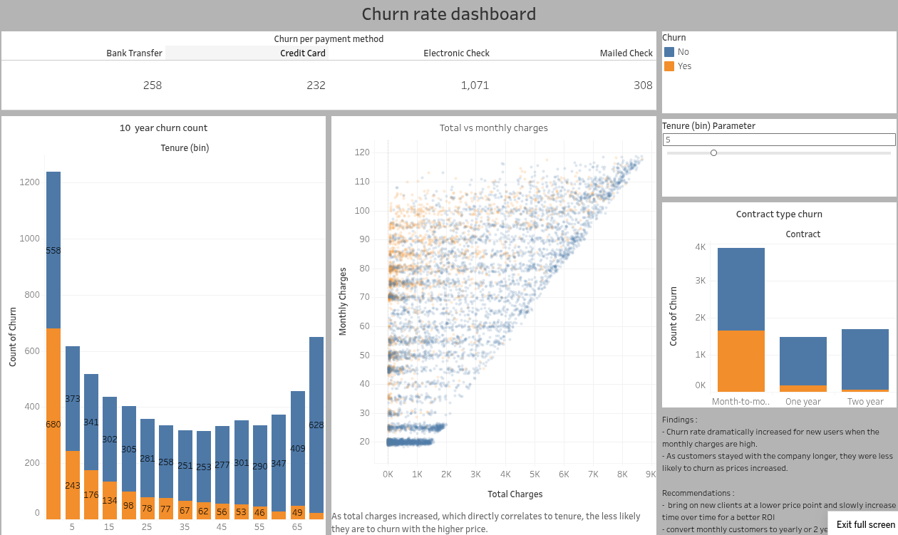
This Tableau dashboard explores the churn rate of customers for a subscription-based business model. The visualisations helped discovering the following insights :
- The churn rate dramatically increased for new users when the monthly charges are high. - As customers stayed with the company longer, they were less likely to churn as prices increased.
The business recommendations are:
- to bring on new clients at a lower price point and to slowly increase time over time for a better ROI
- to convert monthly customers to yearly or 2 years contracts with incentive.

Project 2 : Call Centre Analytics
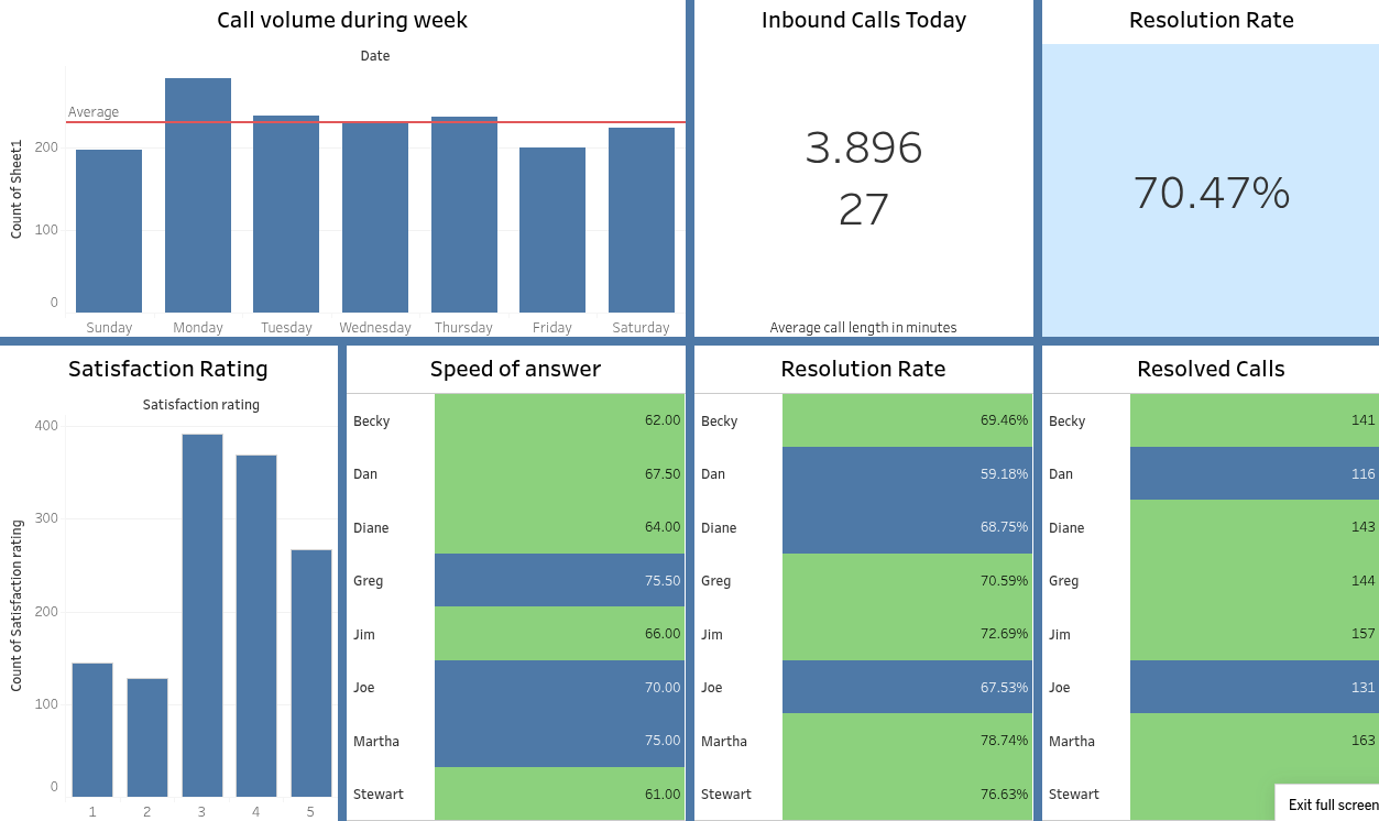
This Tableau dashboard analyses the performance of various agents of a call centre. It is found that:
- The overall resolution rate is 70%.
- There are 27 calls per day on average, with an average call duration of 3.8 minutes.
- Most calls are received on Monday.
- Joe and Dan are the least performing agents, in terms of speed, issue resolution rate and number of calls resolved.

Project 3 : Product Profitability Exploration
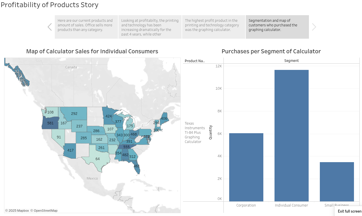
This Tableau Story helps the user understand the profitability of various products, across categories, geographic locations and customer profiles.
- The “Office accessories” category sells more products than any other category.
- The profitability of the “Printing and Technology” products has been increasing dramatically for the past 4 years (64.5%), while other categories have stagnated.
- The graphing calculator showed the highest profit (43% of total profit) in the “Printing and Technology” category.
- Individual customers buy many more calculators than corporations or small businesses.
